Friday 13 February 2015
Thursday 12 February 2015
Digipak Research
This is what a typical digipak for a album would look like, as you can see there is the same colour scheme used throughout usually to relate to the songs in the album.


In these examples of digipaks the cover has one image which is spread continuously over the sides of the digipak, this gives the whole pack more of an aesthetic look to it

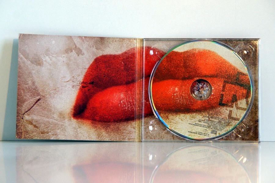
I am thinking that I would like to do something like this for my Digipak as it will appeal to the audience of my music video and to be honest the ones where it is one continuous image makes the image look contemporary and fits in with the modern style, also the images used are eye catching and relate to the messages that are being portrayed in the song which is what people are looking for in products.
I am thinking of having my theme continue throughout all three of the products and maybe use the main image from my poster and add it too the digipak, and use the same font and colour scheme throughout all of my products.
Subscribe to:
Posts (Atom)